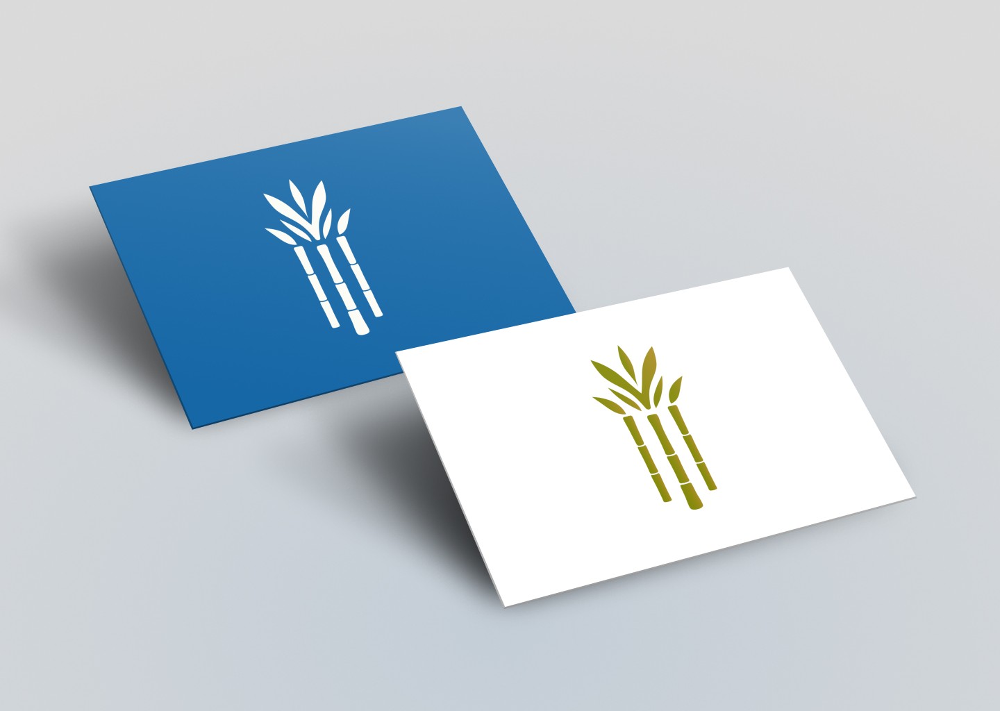
UC AANAPISI Logo
Visual rebrand for the UC AANAPISI (Asian American, Native American, Pacific Islander Serving Institution) Initiative.
The Opportunity & Impact
Existing graphics lacked a unified and personable identity needed for a major national conference. I created a logo that moved away from restrictive legacy elements to better reflect a brand that works for the AandPI community. By openly communicating about the design constrains and possibilities, I crafted a logo that honors cultural roots while maintaining UC's institutional prestige.
Takeaways
This project highlighted that consistent, transparent dialogue with clients is essential when designing culturally significant symbols. Navigating the shift from initial constraints to a new creative direction required trust and design advocacy.
Role:
Graphic Designer
Deliverables:
Logo Design
DISCOVERY & RESEARCH
Starting from existing UC AANAPISI graphics and international AANAPISI orgs.
I conducted research on existing logos and graphics to identify successful visual patterns and community motifs. This research ensured the new identity would feel both unique to the UC system and family to the broader professional network. I made note of existing promotional graphics to consider a similar visual palette to connect users with the organization's rebranded logo.


EARLY CONCEPTS
Designing based on initial client constraints (existing graphic visuals and the UC integration).
Initial designs focused on a warm red and orange palette similar to existing promotional graphics while attempting to integrate the formal University of California seal. These designs prioritized the institutional element but struggled to capture the specific energy of the "Collective Action" theme.


ITERATIONS
Client feedback allowed me to pivot to a more organic, community focused direction.
Based on client feedback and initial direction, we made the decision to remove the UC seal and moved away from the warm color scheme. This pivot, with approval from the client, allowed me to break free from constraints of corporate aesthetics, and learn into a more organic, community focused direction.


FINAL DESIGN
Final logo symbolizes culture, community, and growth.
The final logo utilizes bamboo motifs to symbolize culture, community, and growth. The resulting identity is modern and successfully blends professional standards with cultural storytelling in one visual piece.

BIGGEST CHALLENGE
Start from nothing and create a logo relevant to AandPI identities.
The primary challenge was balancing strict institutional requirements with the 2025 theme of "Celebrating Collective Action".
OPPORTUNITY
The primary challenge in creating this logo was balancing strict institutional requirements with the 2025 theme of "Celebrating Collective Action".
OUTCOME
The rebrand was scaled across all 2025 APAHE conference materials, including program itineraries, presentation decks, and pamphlets. This created a more professional, cohesive experience that strengthened the initiative's presence on a national stage.
Before & After