Open Source San Jose
Open Source San Jose is a non-profit volunteer group that unites coders, designers, researchers, and community members to build tech projects in partnership with local government and organizations to improve San Jose and the surrounding Bay Area.
The Opportunity & Impact
I was working with the challenge to make Open Source San Jose’s website more approachable through a reduction in information overload and a stylistic overhaul that conveyed a sense of friendliness and approachability.
Role:
UI/UX Designer
Deliverables:
Home page re-design
UX
Too much vertical scrolling before the essential information (when, where, how). Most people probably weren't making it that far.
UI
"Corporate nonprofit" is the wrong tone when it comes to a website that's dedicated to a niche community of builders & problem solvers that is meant to bring people together.
01
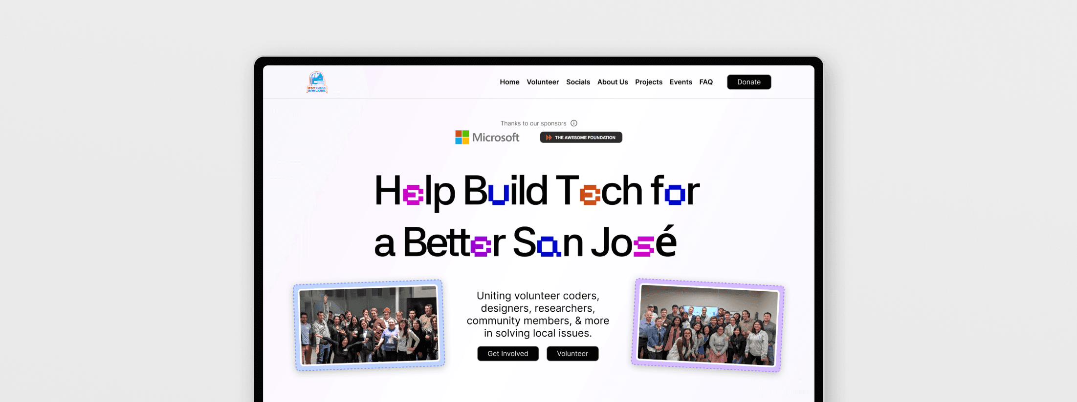
Broke down the home page's six sections into 4 purposeful sections.
Once I differentiated the six sections, it was obvious that some sections doing way more work than others. It all comes back to the question, "What are we trying to accomplish?" to figure out a better hierarchy.
02
Rethought what needed to be loud.
Sponsor logos (Microsoft & The Awesome Foundation) moved up top since they build trust fast. Wordy walls of text became drop-down cards so users can choose to read more if desired. Images and CTA buttons that took up entire sections were placed along side each other to develop a better hierarchy.
03
Cut length without content.
The wordy walls of text still contained valuable information, so I truncated the first few lines. This way, users can still get a preview into mission statements and other valuable context. The donation/tax info that was useful for donors, a narrower user base, became hidden under an information icon as well.

COLOR
Pulled colors, stroke, and dashed lines straight from Chrome's inspect element panel.

MOTIFS
Continued motifs to online "tech" culture of Open Source SJ using pixelated secondary font.

TONE
The overall tone shifted from a dark grey/blue/orange base to a lighter palette.
These changes, along with the "tech" motifs, opens the door of Open Source San Jose and emphasizes approachability and community.
Fewer manual scrolling for important information.
Reduced content zones with clearer UX hierarchy. Users flow through the home page and find essential information quicker.
Nothing hidden from the user.
Reduced scrolling doesn't have to mean less content. Users get the full picture while additional information is a click away through collapsable cards and read more icons.
A pivot that eliminated one less bug.
Shifting away from the 2x2 grid layout perfected the structure in a way that considered actual use cases.


